Using Elevation In Android Applications
layout: post author: adam title: Using Elevation In Android Applications description: Discussion of some of the best ways to handle elevation in your Android application. modified: 2015-09-15 published: true tags: [elevation, material design] categories: [android]
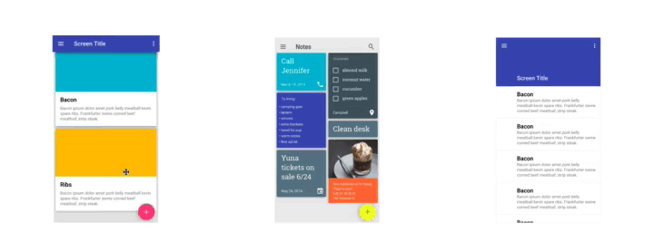
The backbone of Material Design is to design your user interface in a way that is simple and intuitive for users, in the same way we use our intuition with real life materials. One of the many ways this is achieved is through the use of elevation in Android UI components, demonstrated here:
By adding shadow to represent the elevation, your users can intuitively determine the different surfaces in your application. This gif is courtesy of Roman Nurik’s tweet of an open-source layout visualizer. As with many designs, there are no strict requirements for using elevation in Android apps, but you can follow these three steps in order to make the best use out of it.
Determine what surfaces you need
Let’s break down the three screens you see above. In the first one, we have three types of surfaces. One being the Toolbar at the top, one for the FloatingActionButton, and one for each of the individual cards. Be sure to note that each of the individual cards have the same elevation. This is a great way to show that elements are different, but of equal importance.
The second screenshot is an even better example of showing things of different values that are of equal importance. In this application a user has to complete a variety of tasks such as calling someone, completing a list, or cleaning their desk, it is helpful to show all of these tasks on an individual surface to emphasize the difference between them. However, since they all fall in the category of tasks to be completed, they can be grouped together by giving each of them the same amount of elevation. The FAB in this example is accented both by a higher color and a larger elevation, so it is clearly not part of our tasks.
In the third example there is an animation showing how two surfaces may start at the same level, but as the list scrolls the Toolbar rises up to let the list pass underneath it. Also in this example each row of text is on the same surface. This is useful because there is very little difference between items, and separating them only makes it harder on the user to scan over them quickly. You can look at the Material Design Spec for more information on when to use, or not to use cards.
Determine how your surfaces will stack in relation to each other
What you should do in this step is consider each of the surfaces you have defined in the last step, and rank them in order of importance. In the first screenshot above, the FAB is given the highest elevation in that screen, typically 6 dps. Next is the Toolbar with 4dp elevation, and the Cards themselves with 2 dps. When determining which elevation to use for each component, take a look at the specifications which can give you an idea. Always remember that these are just guidelines, and not strict rules. The most important thing to take away from this step is to use elevation to give users an intuitive way to navigate through the screen. If you feel that your individual Cards are more important than the Toolbar, don’t give your toolbar any elevation, like the second example above.
Add the elevation in XML
Adding the elevation to components in Android is the easiest part, as all you need to do is set the elevation attribute, added in API 21. For example, you can give your FloatingActionButton the necessary 6 dps elevation like this:
<android.support.design.widget.FloatingActionButton
    android:layout_width="wrap_content"
    android:layout_height="wrap_content"
    android:layout_margin="16dp"
    android:layout_gravity="bottom|end"
    android:elevation="6dp"/>
During this step, you will also want to consider if any elements require an additional elevation upon being pressed. When using a button, you may want to add extra elevation to make it appear as if it rises up and meets your finger when you press it, or sink further down. To do this, you can just use the pressedTranslationZ attribute:
<android.support.design.widget.FloatingActionButton
    xmlns:fab="http://schemas.android.com/apk/res-auto"
    android:layout_width="wrap_content"
    android:layout_height="wrap_content"
    android:layout_margin="16dp"
    android:layout_gravity="bottom|end"
    android:elevation="6dp"
    fab:pressedTranslationZ="12dp"/>
Following these three steps to use elevation in your Android applications will help you create a much more understandable and intuitive user interface that is both simple to use and visually appealing. As always, make sure to browse the Material Design specifications on elevation for more examples and specific use cases that aren’t discussed here.