Designing User Interfaces For Android Wear Part 2: Cards
User interface for Android Wear have all the same components as a phone’s UI, they just appear a little differently. In this post we’re going to talk about Cards. You’ve most likely seen these in the Google now app, among other Material Design apps. Cards are great because they are a component that is able to provide a consistent look across multiple platforms.
We will consider this post as a deeper dive into an existing tutorial in the Android docs, but as that one states the Cards discussed here are not the same as the Cards that appear as notifications on Android Wear. See the link to better understand this distinction. Let’s go over some of the relevant classes, and we’ll discuss their differences and how to implement them.
CardFragment
The CardFragment class provides much of what you may already need. It is a view for a vertically scrollable and expandable Card which contains a title, description, and icon, though any of this can be overridden as necessary. Adding it to your app is relatively simple. Inside your activity’s xml file, you will need to define a FrameLayout for placing the CardFragment:
<android.support.wearable.view.BoxInsetLayout
    xmlns:android="http://schemas.android.com/apk/res/android"
    xmlns:app="http://schemas.android.com/apk/res-auto"
    android:layout_height="match_parent"
    android:layout_width="match_parent">

    <FrameLayout
        android:id="@+id/frame_layout"
        android:layout_width="match_parent"
        android:layout_height="match_parent"
        app:layout_box="bottom">

    </FrameLayout>
</android.support.wearable.view.BoxInsetLayout>
Then you can build your CardFragment inside of your Activity and display it using a FragmentTransaction:
FragmentManager fragmentManager = getFragmentManager();
FragmentTransaction fragmentTransaction = fragmentManager.beginTransaction();
CardFragment cardFragment = CardFragment.create("Title",
        "Description",
        android.R.drawable.ic_dialog_alert);
fragmentTransaction.add(R.id.frame_layout, cardFragment);
fragmentTransaction.commit();
The benefits of using a CardFragment are that it already provides the default layout for you if that is all you need. In addition, the class itself extends from fragment so some of the components behavior may already be familiar to you.
CardFrame
Very similar to the class above, CardFrame provides a view with a white background, rounded edges, and a small drop shadow. It is different because it does not provide any default layout. So, if you’re looking to make your own Card for your Wear application, this class will work for you. Another distinction, however is that the CardFrame does not support scrolling by default. That is where the next class comes in.
CardScrollView
The CardScrollView class provides the vertical scrolling for a CardFrame in each direction. The intended implementation is to nest the CardFrame inside of it, as we will see in the XML below. As discussed in the last post, the Wearable library also offers a BoxInsetLayout class which is used to display views in the same way on both round and square devices. It can be useful with the CardScrollView, but not completely necessary. Here’s why:
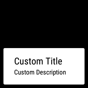
A CardScrollView will detect the screen shape and display the Card appropriately. Square devices typically have a margin around the Card, while round devices have larger padding on the text. Given that, it might appear that a BoxInsetLayout is useless. Contrary to that, without one you may risk Card content being cut off on the bottom of round devices. Instead, using a BoxInsetLayout and applying the box_inset="bottom" attribute to your CardScrollView, you are able to align the Card to the bottom of the screen without cropping its contents. Here is what the XML for all that looks like:
<android.support.wearable.view.BoxInsetLayout
    xmlns:android="http://schemas.android.com/apk/res/android"
    xmlns:app="http://schemas.android.com/apk/res-auto"
    android:layout_height="match_parent"
    android:layout_width="match_parent">

    <android.support.wearable.view.CardScrollView
        android:id="@+id/card_scroll_view"
        android:layout_height="wrap_content"
        android:layout_width="match_parent"
        app:layout_box="bottom">

        <android.support.wearable.view.CardFrame
            android:layout_height="wrap_content"
            android:layout_width="match_parent"
            android:layout_gravity="bottom">

            <LinearLayout
                android:layout_height="wrap_content"
                android:layout_width="match_parent"
                android:orientation="vertical"
                android:paddingLeft="5dp">
                <TextView
                    android:layout_height="wrap_content"
                    android:layout_width="match_parent"
                    android:text="Custom Title"
                    android:textColor="@color/black"
                    android:textSize="20sp"/>
                <TextView
                    android:layout_height="wrap_content"
                    android:layout_width="match_parent"
                    android:text="Custom Description"
                    android:textColor="@color/black"
                    android:textSize="14sp"/>
            </LinearLayout>
        </android.support.wearable.view.CardFrame>
    </android.support.wearable.view.CardScrollView>
</android.support.wearable.view.BoxInsetLayout>
Since the Card is predefined in XML, you won’t need to do anythign special in the Activity unless you chose to manipulate it. The CardFrame example looks like this:
I hope that now you have a little better foundation of Android Wear and some of the special UIs you can create for it. In the future I will be expanding on the Wear platform, discussing things such as 2D pickers and notifications. Let me know in the comments what you’d like to learn next!